The Basics of Matching Kimono and Obi Colors (Beginner's Guide)
When you first start thinking about wearing a kimono, the biggest question is usually: "How do I match the colors?"
With Western clothing, there are safe go-to combinations like "black and white" or "beige and navy." Kimono and obi (the wide sash worn around the waist) are a bit different — traditional rules and seasonal associations come into play, which can make beginners feel unsure of where to start.
Here we'll walk through the basic thinking behind color coordination, along with tips anyone can use to avoid common mistakes.

The Golden Rule: One "Star," One "Supporting Role"
When planning a kimono outfit, think of your kimono and obi as having two roles: a "star" and a "supporting role."
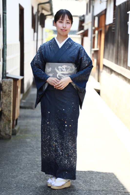
If the kimono is the star, choose a calmer, more understated obi.
If the obi is the star, keep the kimono plain or simply patterned.
If both are bold, they'll clash and the outfit will feel busy. If both are too plain, the look can feel flat and unfinished.
Examples:
A vivid red komon (a casual kimono with a small repeating pattern) → pair with a beige or gray obi
A soft, plain-colored kimono → dress it up with a deep navy or gold-thread obi
Deciding which piece will be the "star" and which will play the "supporting role" is the first step to a coordination that works.

Using the Color Wheel for Harmony
The color wheel is a handy tool for thinking about color coordination — and you don't need to overthink it. Just keep three approaches in mind:
Same-family colors (e.g., a pale pink kimono with a wine-red obi) → creates a gentle, cohesive, reassuring look.
Contrasting colors (e.g., a cream kimono with a deep green obi) → adds definition and a vivid, eye-catching feel.
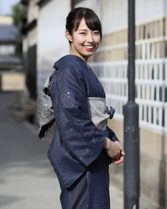
In-between, neutral tones (e.g., a light blue kimono with a gray obi) → great if you're not confident with contrast; gives a natural, calm impression.
By moving between "harmony" and "accent," you can make almost any kimono-and-obi color combination look beautiful.

Add Seasonal Flair for a More Polished Look
Seasonal awareness has always been an important part of kimono culture in Japan. Simply choosing colors that match the season can instantly make an outfit feel more refined.
Spring: pale pink, young grass green, wisteria purple
Summer: white, pale blue, light indigo (asagi), navy
Autumn: deep crimson (enji), mustard yellow, deep green
Winter: black, deep navy, gray, red
For example, pairing a pale pink komon with a white-based obi in spring creates a soft, gentle impression. In autumn, the same kimono paired with a dark brown or mustard-colored obi brings out a calmer, seasonal mood.

Color Choices That Suit Different Ages
The colors that flatter you can also shift with age. For beginners, thinking about "colors that suit me" makes it much easier to wear kimono with confidence.
20s–30s: Bright, vivid colors work well (pink, light blue, bright beige, etc.)
40s–50s: Calmer base colors with a pop of accent color (gray, purple, deep crimson, deep green, etc.)
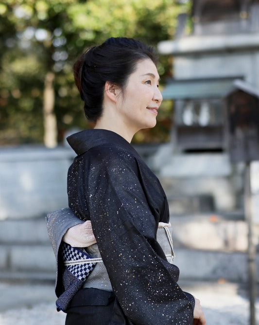
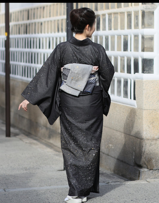
60s and beyond: Elegant, understated base colors, with the obi and accessories adding sophistication (deep navy, black, silver-gray, obis with gold or silver thread, etc.)
People in their 40s and beyond often worry: "Too bold and it feels out of place; too plain and it ages me." In that case, aim for balance — keep the kimono in calm colors and let the obi bring in the brightness.

Fine-Tuning with Obi Accessories
Even after settling on your kimono-and-obi color combination, you might feel something is "a little lacking" or "a bit too strong." That's where accessories like the obijime (the cord tied over the obi) and obiage (the sash tucked above the obi) come in handy.
If the overall look is too pale → add a deep-colored obijime (deep crimson, navy)
If the contrast is too strong → soften it with a neutral-toned obiage (gray, beige)
If you want to add seasonal flavor → bring the season into just the accessories (light blue in summer, mustard in autumn, etc.)
Think of these accessories the way you'd think of jewelry with Western clothing — small details that make all the difference in balancing the final look.
In Summary: Start with "Safe Meets Striking"
Matching kimono and obi colors can go surprisingly deep, but there's no need to overthink it at first. For beginners, a simple approach works well:
A plain, pale-colored kimono × a deep-colored obi
A simply patterned kimono × an understated obi
Starting with this "safe meets striking" balance is a reliable way to avoid major missteps. Once you get more comfortable, you can gradually experiment with bolder colors and patterns to develop a style that's uniquely yours.

Keep in mind that a "striking" obi featuring distinctly seasonal motifs, like floral patterns, tends to be a bit harder to coordinate. Obis with geometric patterns, on the other hand, are a great and easier choice to try.

Please refer to this website if you like.
▶▶▶ Kimono Outfit Reference Items: Introducing Kojima Obi
Kimono can seem intimidating at first, but once you know the basic rules, you'll find it actually offers even more freedom and room for personal expression than Western clothing.
Why not take that first step and give it a try?